The Transmission Problem

Why premium fashion brands often struggle to show their value online

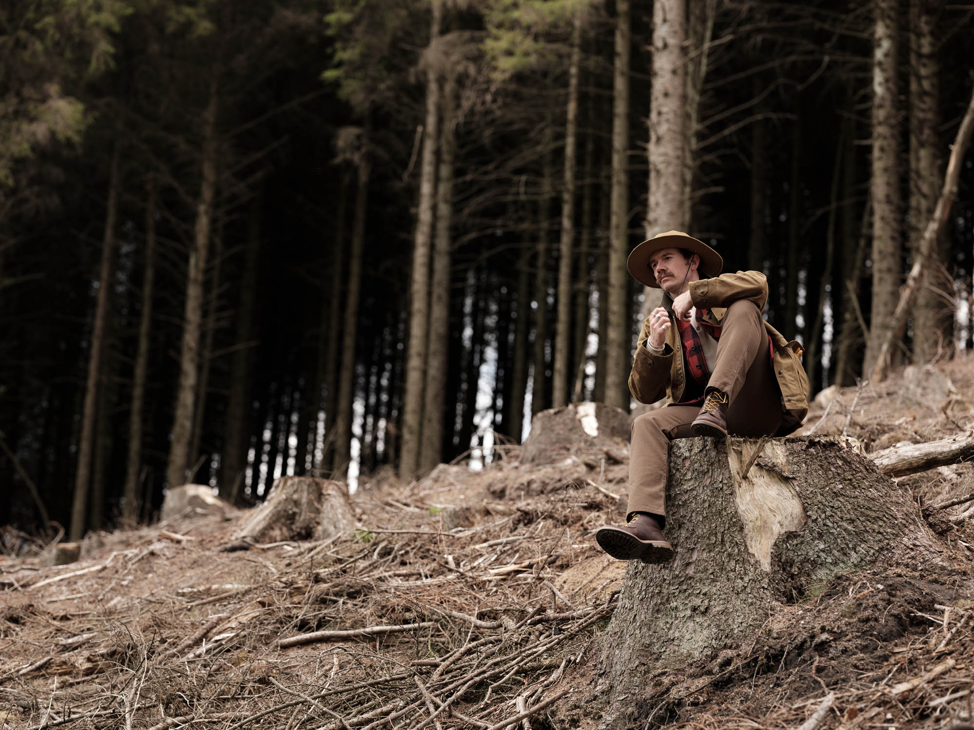
Most premium or heritage fashion brands make perfect sense in person. They’re often much harder to understand online.

Walk into any good bricks-and-mortar store and you’re unlikely to just be handed a product. You’re given context, often without really noticing it happening. Where it was made. Why the fabric feels the way it does. A small detail about how it’s constructed, or why it’s different from everything else on the rail.

You leave knowing what you bought, not just what it looks like. That knowledge stays with you. It changes how it feels, what you’d be willing to pay for it again, and how readily you recommend it to other people.

Now visit the same brand’s website.

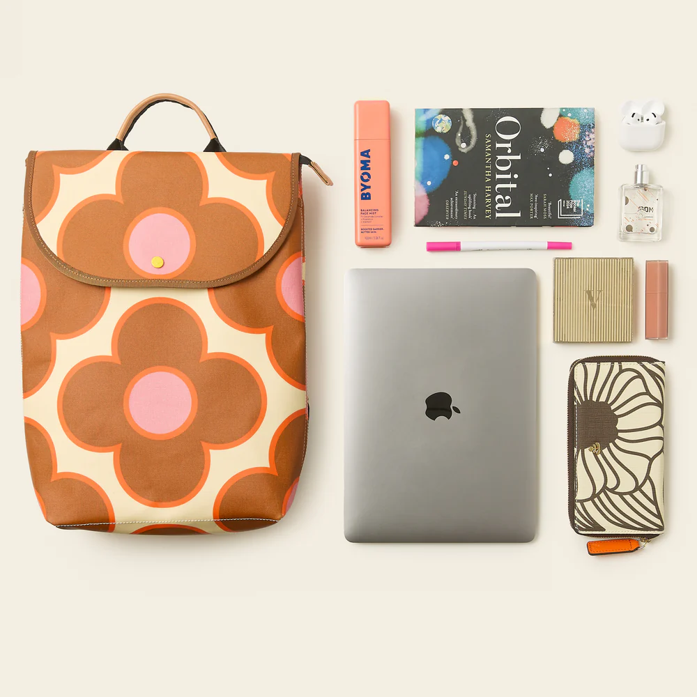
You’ll usually find strong photography, a short description, a size guide, a price, and an add to bag button. It’s clean, it functions, it looks right.

But something has dropped away.

The brand that communicated so naturally in person has gone quiet. The context hasn’t made the journey, and the customer, who was never in the room to begin with, has no way of filling in the gaps.

That’s the problem.

Where the value gets lost

Premium fashion isn’t generally expensive because of the margin. It’s expensive because of everything that happened before the product ever reached the shop floor.

Specific materials sourced from specific places. Production methods that are slower, more deliberate. Decisions made about proportion, weight, finish and construction that most people won’t consciously analyse, but will feel over time.

That’s where the value lives.

Very little of that comes through by default online. A photograph can show what something looks like, but it rarely explains what it is, how it was made, or why that matters. Without that layer, you’re left browsing without fully understanding what you’re looking at.

And when that happens, you do what anyone would do. You compare.

What happens next

In-store, the brand does a lot of the work for you. The environment, the people, the way things are explained. Online, none of that exists unless it’s been deliberately built in.

Most people arrive mid-scroll, often with alternatives open in other tabs, trying to answer a simple question: is this worth it?

If the site doesn’t help them answer that, they answer it themselves. And in most cases, that means falling back on price. Not because price matters most, but because it’s the easiest thing to understand when everything else is unclear.

This is where most premium brand websites fall short.

Not visually. Not technically. In what they actually communicate.

Product pages describe, but don’t explain. Imagery looks good, but doesn’t always add understanding. Navigation helps you find things, but doesn’t do much to guide interpretation. The brand’s point of view, which is often the most valuable part, is either diluted or sitting somewhere most people won’t go looking.

“Most premium brands don’t have a product problem, they have a clarity problem. The value is there, it’s just not being communicated in the places where customers are making decisions.”

Michael Mason, eCommerce Lead at Farrows

What this costs

When that happens, the effects are predictable.

People hesitate. They leave. They come back and still don’t buy. Or they choose something easier to justify.

The brands that feel this most are usually the ones with the most to say. The deeper the product, the more value is lost when that understanding doesn’t come through.

What needs to change

Simply adding more content isn’t the issue. The challenge is making the right information visible at the moment it’s needed.

The clearest place to start is the product page, because that’s where the problem is most obviously felt. It’s also where most decisions are made.

You can’t assume that brand context will be discovered elsewhere. Placing it on an About page and expecting customers to go looking for it is optimistic at best. Most won’t. Many will land directly on a product page from search, social or paid activity, and make a decision from there.

If the context isn’t present in that moment, it may as well not exist.

What would someone in-store point out? What would they say to help you understand why this is worth it? That’s the layer that’s missing.

Material. Origin. Construction. Intent. Whatever matters, it needs to sit alongside the product, not somewhere else on the site.

We’ve seen this first-hand in our work with brands like Tricker’s and Orla Kiely, where relatively small changes to how product detail pages communicate material, origin and construction have made a noticeable difference to how customers engage and convert. The product didn’t change. The way it was understood did.

But this isn’t limited to the product page. The same issue runs through the wider experience.

Collections should help frame what the customer is looking at, not just group products together. Imagery should add context, not just fill space. The experience should feel like it understands the differences between brands and products, rather than smoothing them out.

Where to start?

You don’t need a better story. You just need to make the one you already have easier to see, in the moments where people are deciding whether to buy.

That’s where most of the value is being lost.

Farrows is a brand and ecommerce agency. We work with premium fashion brands to close the gap between what they are and what their customers can see online.

If any of this feels familiar, it’s usually a good place to start a conversation.

Lets talk,
Get in touch

Royal Warrant

Royal Warrant Holders to Her Majesty The Queen, since 2003. Awarded The Kings Royal Warrant in January 2025. A mark of excellence, the only design agency to achieve this honourable status.